
Auto Advertising Mistakes are a marketing goldmine in Indian cities. Their constant movement through narrow lanes, bustling bazaars, and crowded junctions makes them ideal mobile billboards. But high visibility alone doesn’t guarantee results. Many campaigns suffer not from lack of exposure — but from poor execution.
Too often, businesses focus only on being seen, not on being remembered. The result? Ads that look more like noise than influence. If you’re planning an auto ad campaign, here are six mistakes to steer clear of — and what to do instead.
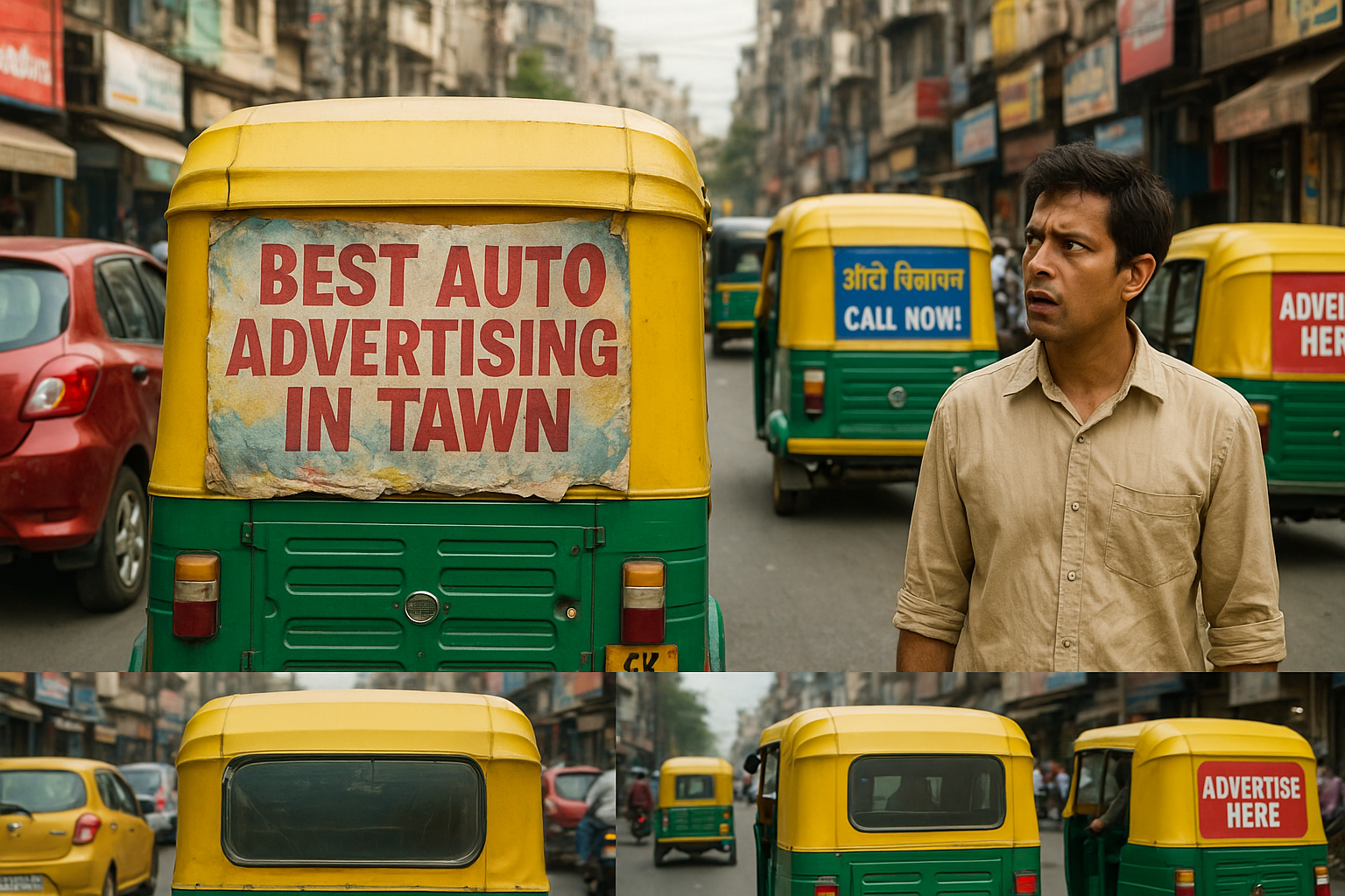
1. Spelling & Grammar in Auto Advertising Mistakes : Tiny Errors, Major Brand Damage
Wrong Example:
“Best Tandoori Resturant in Town” or “Auto Advertising Mistakes” on your banner.
Why it hurts:
Even a small typo can make your brand look unprofessional. Consumers may question your attention to detail — and by extension, your product or service quality.
Fix it:
Always proofread your ad copy — not once, but twice. Involve multiple reviewers, especially if the ad uses multiple languages. Don’t underestimate local dialects or translations.
Outcome:
Well-written content builds instant credibility — even on the move.
2. Unreadable Design: Auto Advertising Mistakes If They Can’t Read It, They Won’t Remember It
Wrong Example:
Fancy cursive fonts, tiny text, or words lost in a cluttered or low-contrast background.
Why it matters:
Your audience gets just a few seconds to absorb your message as the auto zips by. Hard-to-read text means lost attention.
Fix it:
Use bold, clean fonts and high-contrast backgrounds. Keep your message concise — no more than 5–7 words. Visual clarity is your best asset.
Outcome:
Your message gets noticed, read, and remembered — even in traffic.
3. No Call to Action: Awareness Without Action Is Wasted Money
Wrong Example:
“Top Plumbing Services” — with no contact number, website, or QR code.
Why it hurts:
You’ve piqued interest but provided no way for potential customers to follow up. That’s a missed opportunity.
Fix it:
Always include a strong call to action:
✅ “Call +91 8013-8013-59”
✅ “Visit www.acmeadvertising com”
✅ “Scan to order” (with QR code)
Outcome:
You move from just creating visibility to driving real engagement and leads.
4. Bad Ad Placement: Great Design, Wrong Spot
Wrong Example:
Ads tucked near the wheels, on mudguards, or partially blocked by doors.
Why it hurts:
Even the most attractive design won’t help if no one can see it clearly.
Fix it:
Position your ad prominently on the rear or side panels. The rear panel, in particular, gets maximum attention from both pedestrians and vehicles behind.
Outcome:
Strategic placement increases your ad’s exposure and effectiveness.
5. Worn or Outdated Ads: From Billboard to Buzzkill
Wrong Example:
A Diwali offer still on display in March, or banners that are faded, peeling, or dirty.
Why it matters:
Old or poorly maintained ads make your brand look inactive, careless, or worse — irrelevant.
Fix it:
Update ads regularly. Align messages with current events, festivals, or seasons. Replace worn creatives quickly to maintain a clean and appealing brand presence.
Outcome:
You stay current, professional, and memorable.
6. Missing Local Connection: Don’t Speak to Strangers
Wrong Example:
An ad in slang-heavy English running in a Hindi-speaking area, or generic visuals that ignore the local culture.
Why it matters:
An ad that doesn’t speak your audience’s language (literally or culturally) will be ignored. People connect with familiarity, not foreignness.
Fix it:
Customize your message for each city or region. Use local languages, cultural references, and relevant visuals. Celebrate local festivals and speak to your audience’s reality.
Outcome:
A brand that feels local earns trust — and action.
Maximize reach with eye-catching ads on autos. Engage local audiences and boost brand awareness on the go Contact us for auto advertising .
Expend your network with us, Let’s connect on LinkedIn